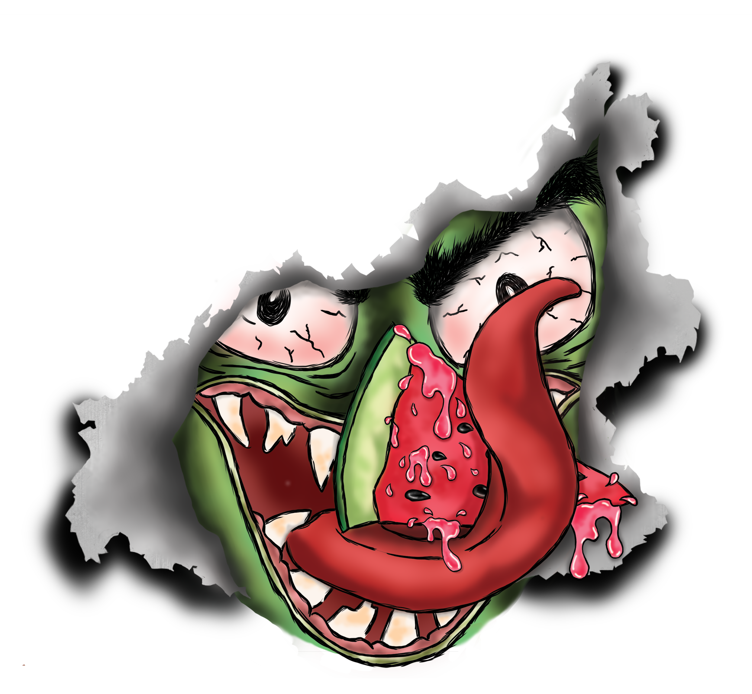
Crank Distillery Branding & Packaging
Illustration, Layout, Typography, Web Design, Packaging
About Crank Distillery
Crank Distillery is a timeless local company rooted in tradition. Crank dedicates itself to its craft, ensuring every product is made with care and with the customer in mind—perfect for those who appreciate a classic taste but also like to venture out occasionally. Bold, fresh, and curious, Crank adapts with the times while remaining deeply connected to its roots. Ultimately, Crank provides something for every occasion, helping customers build memories that last.
The brand embodies this messaging throughout its visual identity. The logo is rugged and takes a classic approach; paired with a sophisticated brand palette of white, black, brown, and gold, Crank establishes a timeless look and feel. When it comes to its offerings, the distillery isn't afraid to explore and be creative. Crank carries everything from traditional beers, wines, and cocktails to irresistible, bold new flavours.
Brazen Packaging
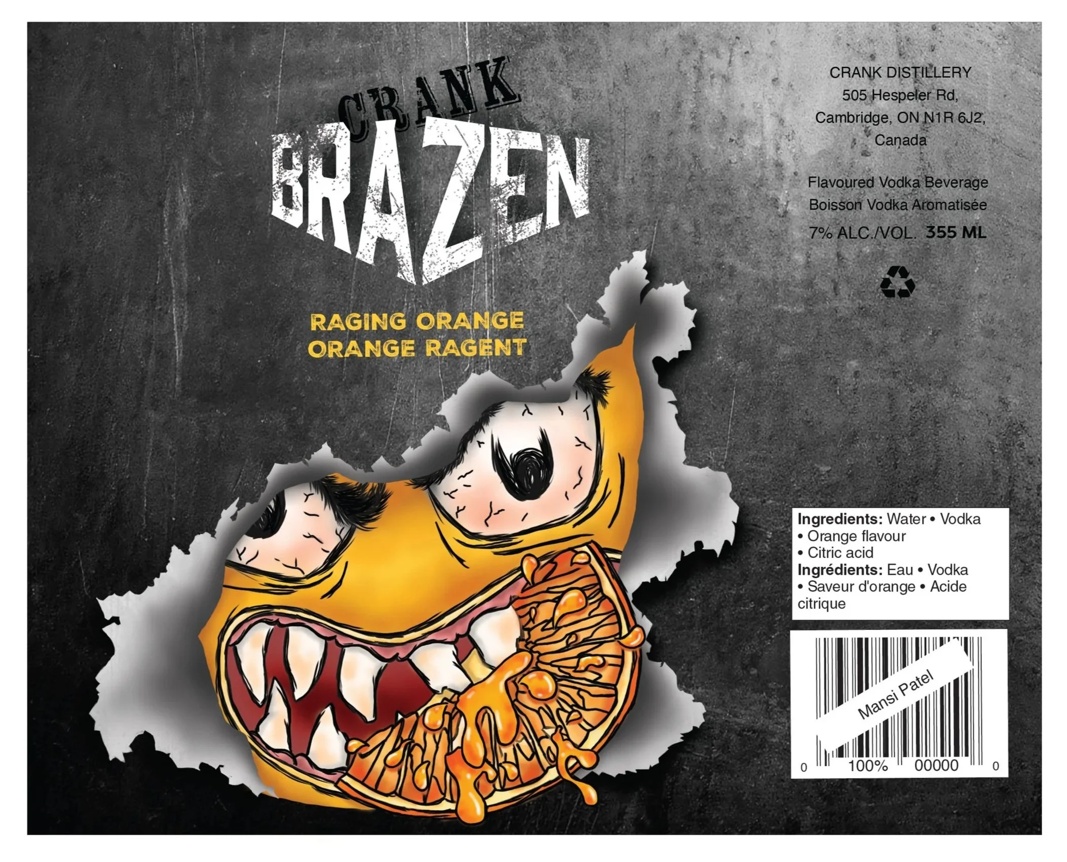
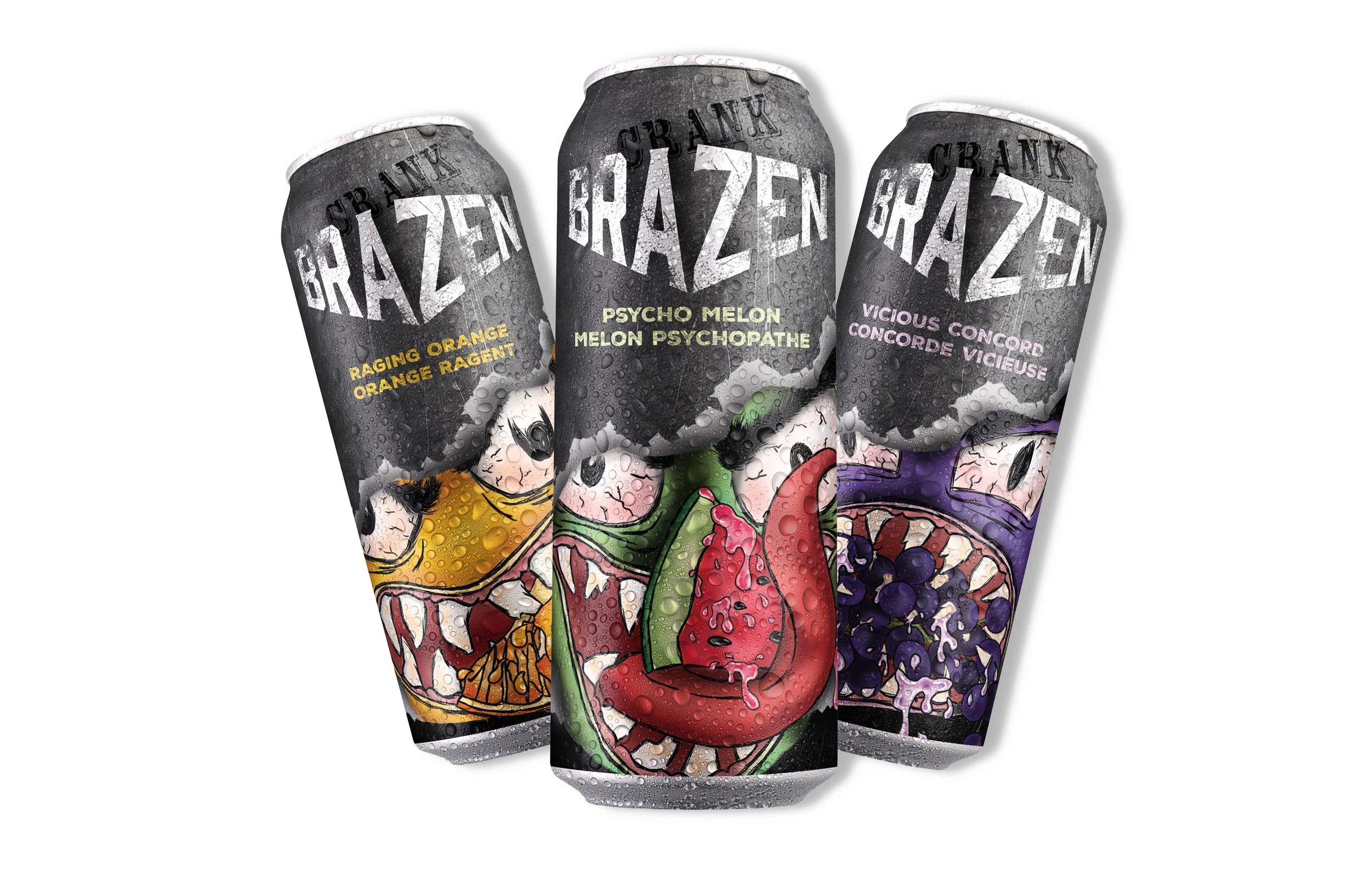
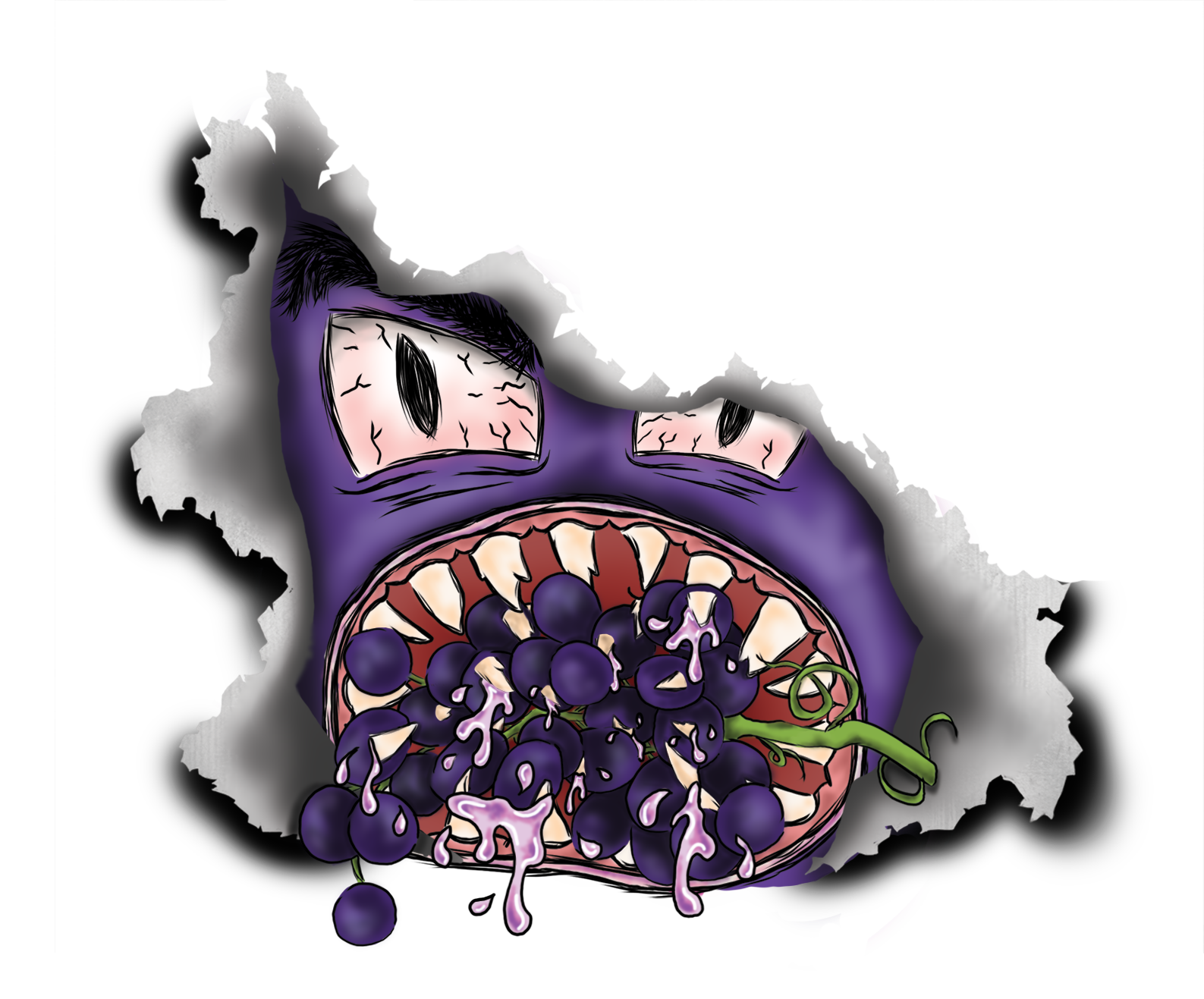
Brazen drinks are bold and bursting with flavour. The packaging is entirely focused on emotion, designed to evoke exactly what the customer will feel, taste, and smell when enjoying the beverages. Setting a vibrant atmosphere, Brazen brings a bright touch to any party or gathering. Both the logo and overall design feature rich textures, implementing the core concept of blending the old with the new to create a fresh experience for consumers. Furthermore, the design and layout are intentionally structured to take front and centre, standing out from afar to remain easily recognizable with a uniquely distinct look.