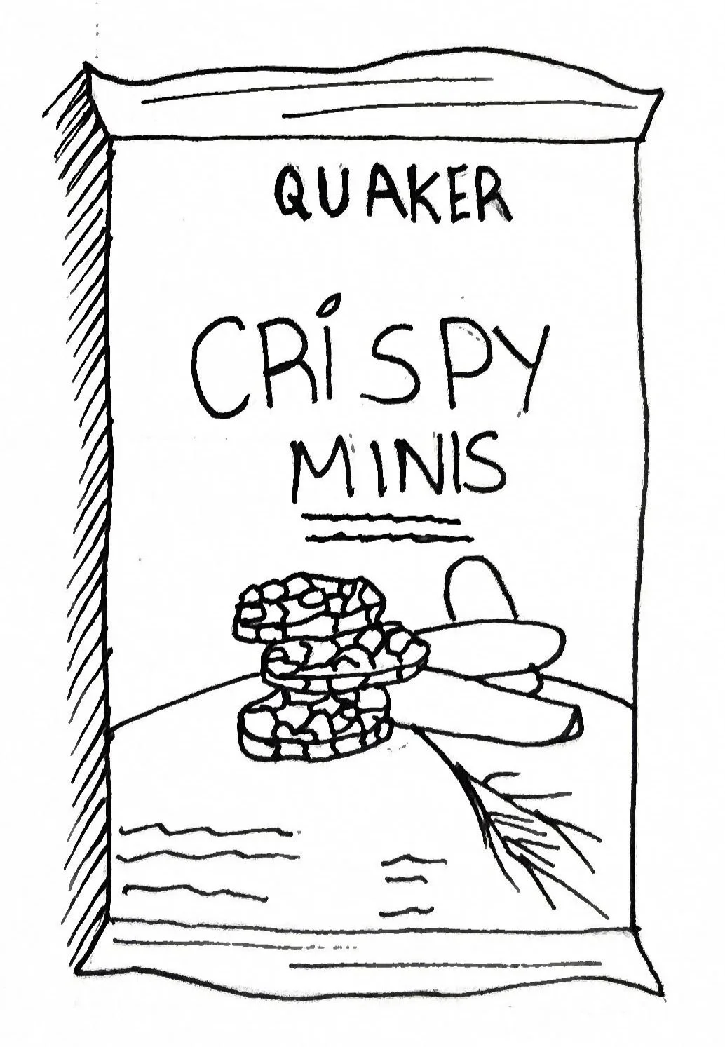
Quaker Crispy Minis Redesign
Packaging, Layout, Photography
The Quaker Brand
Registered in 1877, Quaker was the first breakfast cereal brand to be trademarked and has been a household name for generations. The Quaker name represents exceptional quality and value, a reputation further emphasized by its iconic logo. The original imagery showcases a Quaker man in traditional garb, symbolizing honesty, purity, integrity, and strength. Today, the brand is looking to modernize, positioning itself within the health and wellness sector by producing a diverse variety of wholesome products. While a new, modern logo is now used more frequently as shown above, it can sometimes go amiss and detract from the original Quaker charm.
Logo Redesign
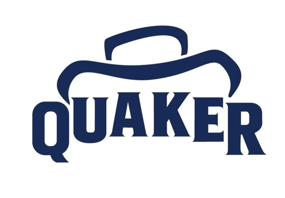
The new logo utilizes elements from both the modern and historical logos. While the typography remains identical to the current version, it introduces a slightly more playful execution, creating a strong base for the new icon to rest upon. The icon itself is inspired by the original Quaker hat, allowing the brand's classic charm to shine through in a modernized tone without explicitly overstating the historical "man in garb" motif. This approach successfully modernizes the brand while retaining a familiar, recognizable element for consumers. Furthermore, this redesign serves to simplify and bridge the differences currently found between the logo variations used in the United States and Canada, ultimately establishing a more cohesive global brand identity regardless of location.
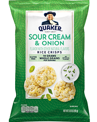
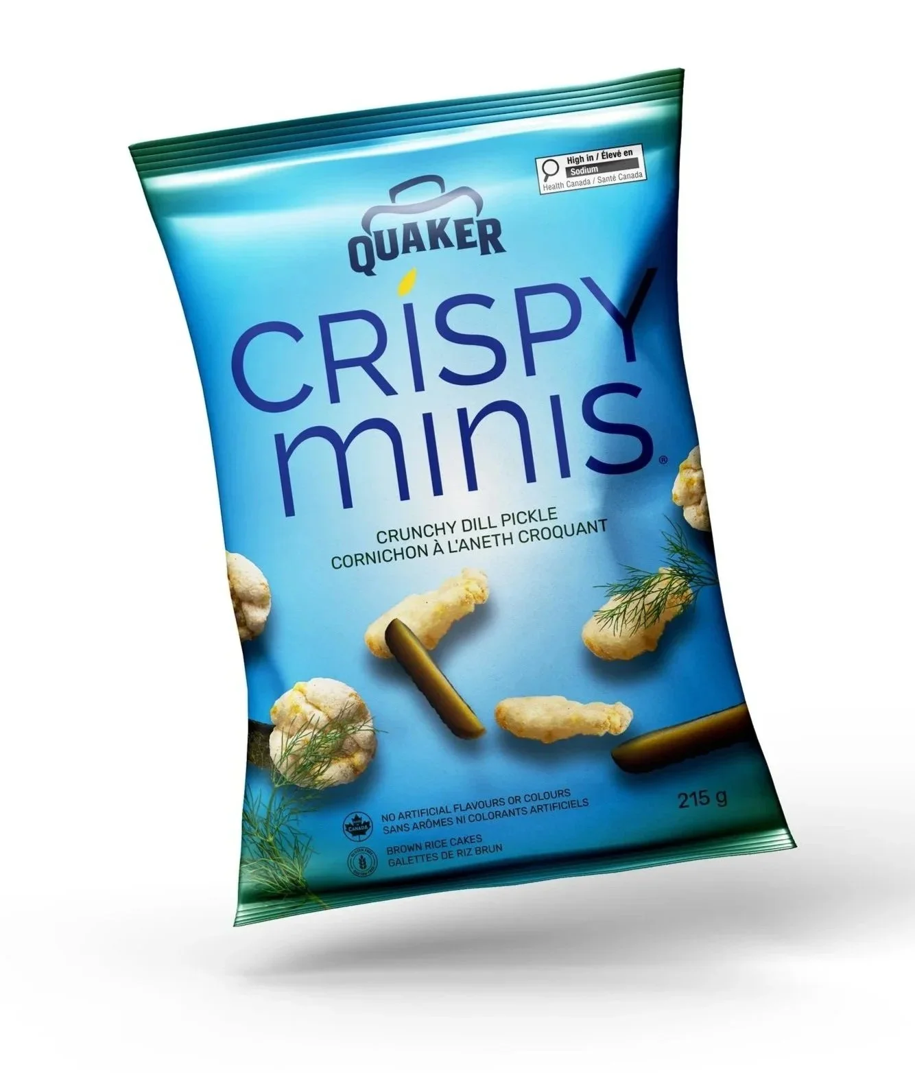
Original American Packaging
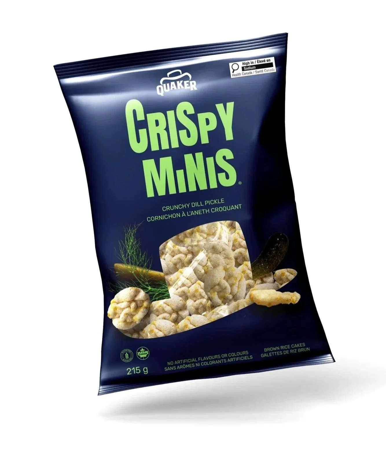
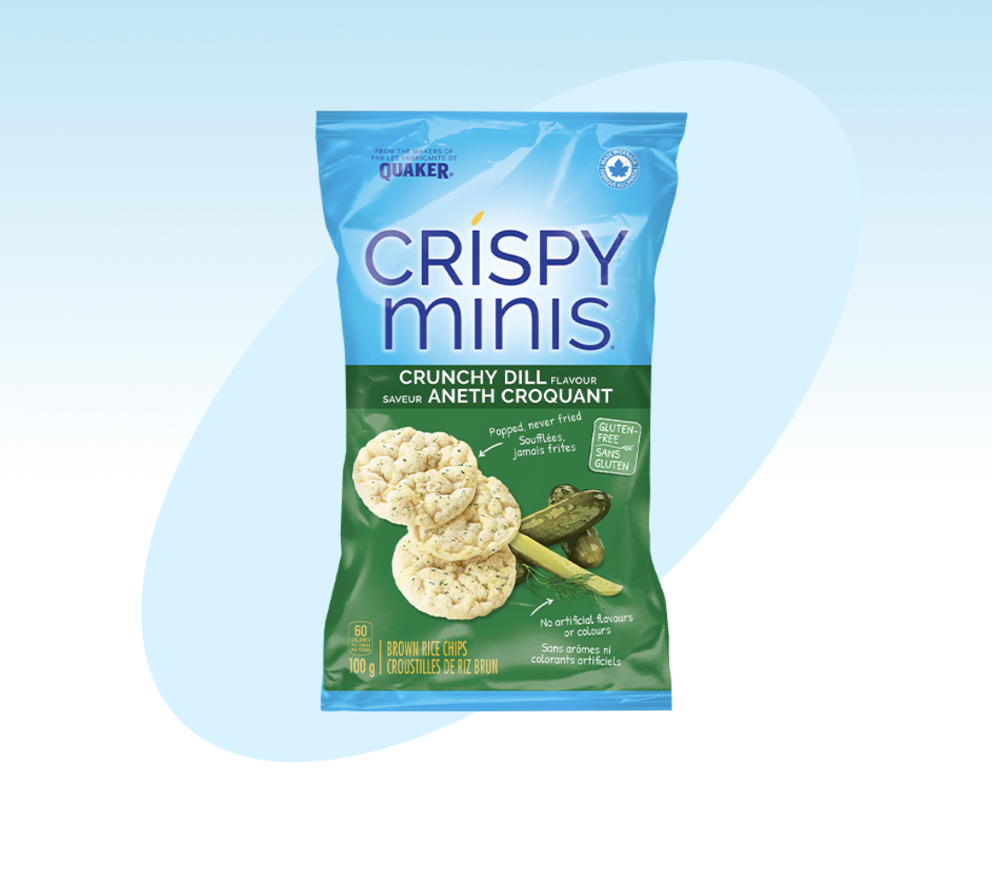
Original Canadian Packaging
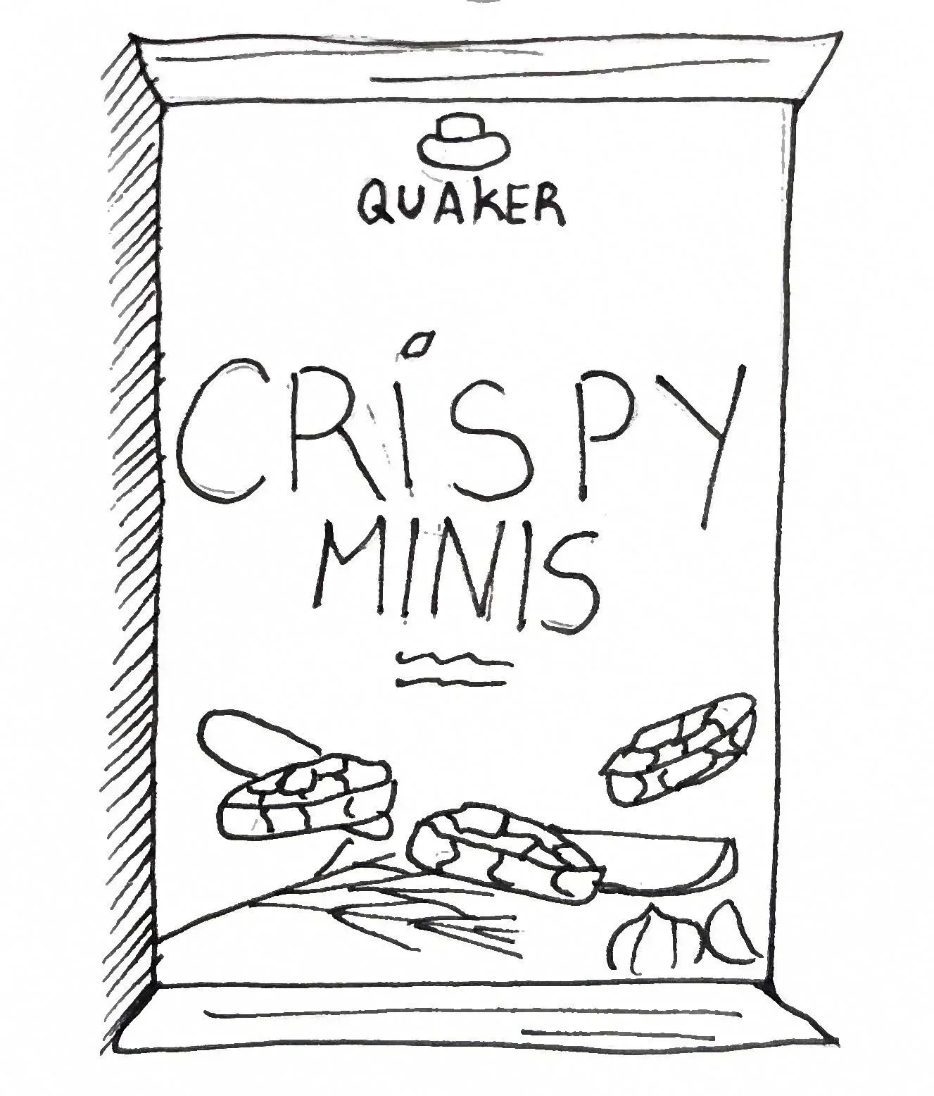
Packaging Redesign
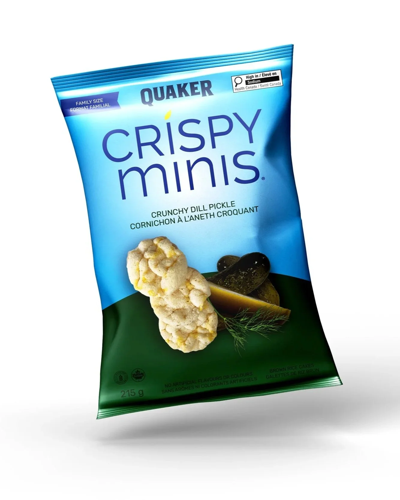
The new packaging was inspired by the American Crispy Minis, which utilize a dynamic approach featuring bolder colours, playful photography, and engaging patterns. From afar, these packages offer great consumer appeal, whereas the Canadian variations can easily get lost on shelves, offering little brand recognition for Quaker. The redesigned packaging takes these factors into account, offering three distinct strategic directions: evolutionary, revolutionary, and transformational. Each variation explores themes that move progressively further away from the original design, providing gradual options for packaging updates as the brand embraces modernization.
Evolutionary
Revolutionary
Transformational