Timmins Family Counselling Centre: Pamphlet Redesign
Layout, Typography
Team Members: Danielle Durand, Eric Rieger, & Kyla Abel
About Timmins Family Counselling Centre
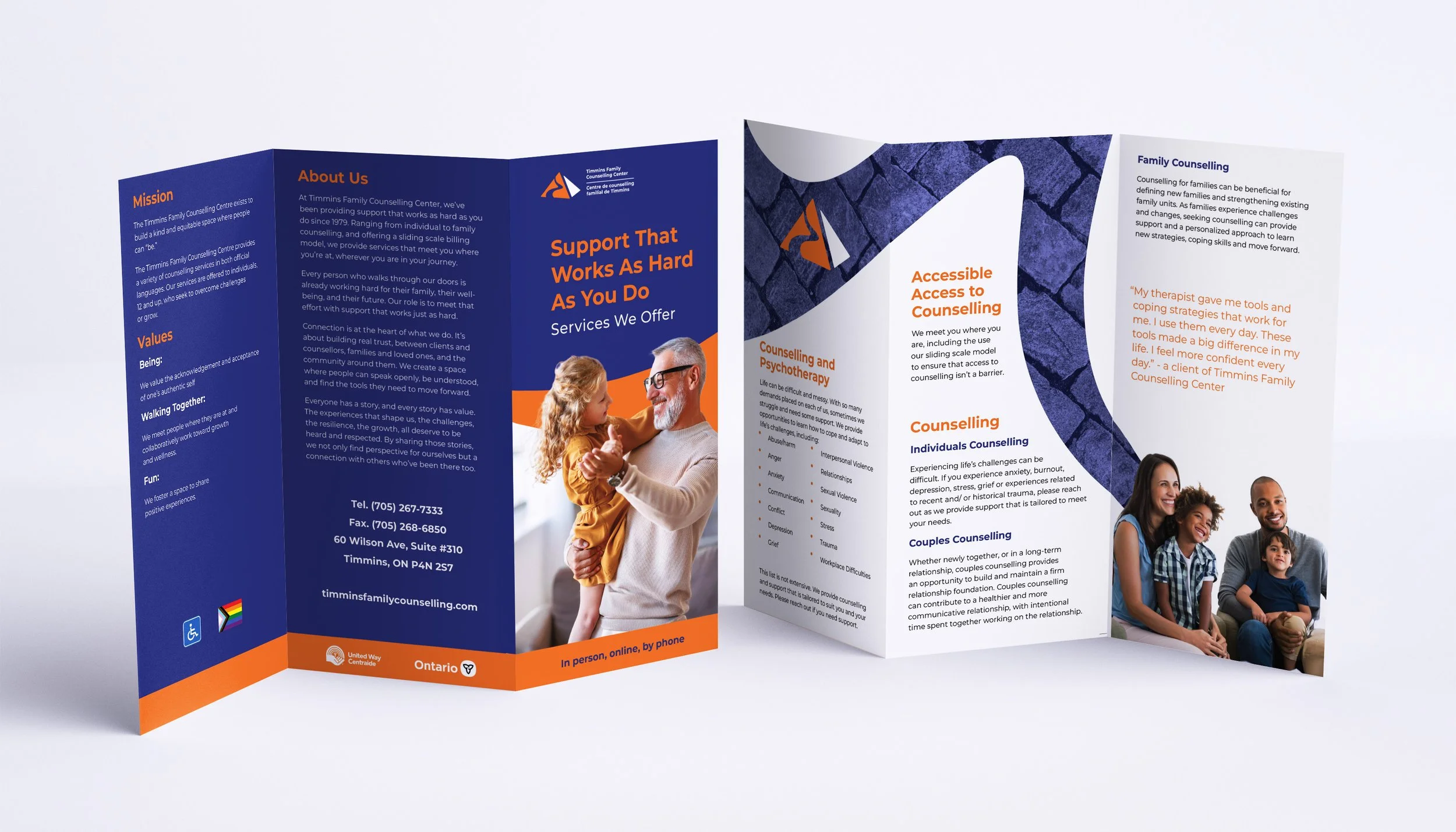
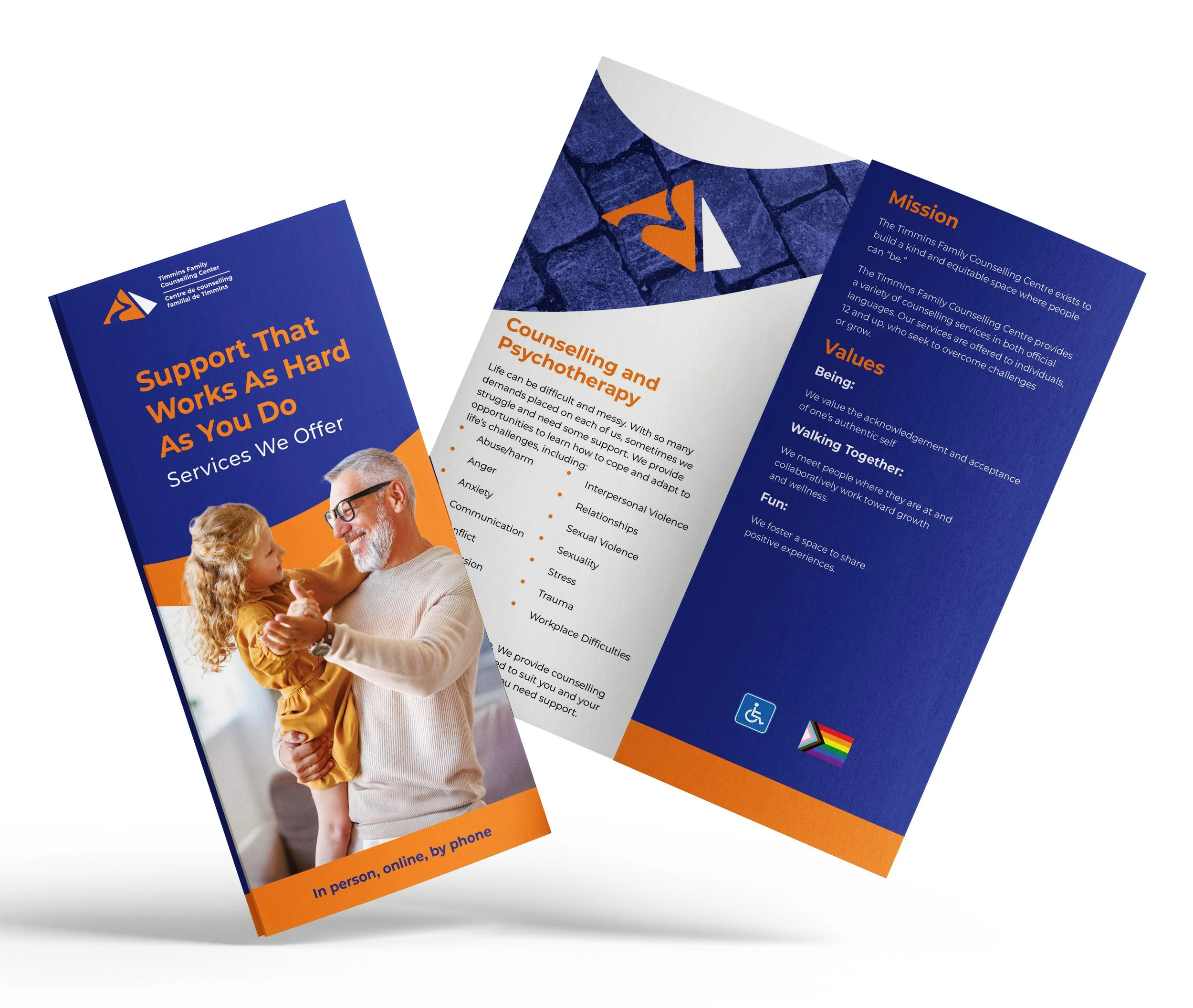
Timmins is home to strong, proud, and community-minded individuals. This means that people often put their needs aside to care for their families and the community. This is where Timmins Family Counselling Centre (TFCC) comes in, working hard to provide support and guidance. Given this, TFCC was focused on increasing public awareness and gaining community engagement. They wanted their key messages to revolve around community, connection, and contribution. Previous branded material had a more clinical look and feel; the goal of the redesign was to bring a human element into it.
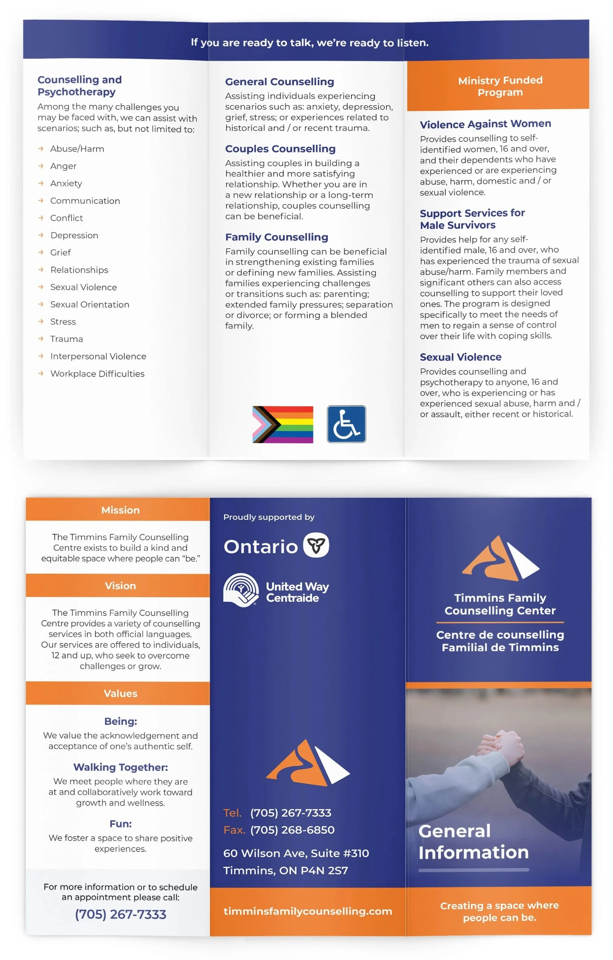
Original Design

Inspiration
The redesign is inspired by the TFCC logo, which is based on the Maslow's hierarchy of needs and showcases the journey one follows as they work on improvement. This icon was used in the pamphlet to showcase progress and growth. The imagery was also adapted to fit an overall inclusive and diverse environment, which TFCC embodies. Together they showcase the outcomes of counseling and the journey a TFCC client may take.